derryX Rant: What’s in a logo?
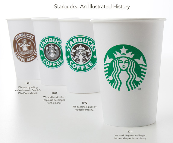
In the past week or so, people have been up in arms about logo changes that a couple of companies have made. The first one that I learned about was Starbucks. They are basically ditching the textual part of the logo as illustrated in the below image.
The buzz is that Starbucks is “doing like McDonalds or Nike.” Aside from the fact that the new Starbucks logo is quite a bit more intricate than either the McDonalds or Nike logos, I see no issues with the change, specifically dropping the text. Especially since it’s almost 20 years since the last logo change. And let’s be honest, guys, it’s not much of a change. It’s the same exact siren with the color inverted, and text omitted.
I was picking up my morning coffee (venti Starbucks Doubleshot with sugar free hazelnut syrup and skim milk) a few days ago, and I asked the barista, who is generally friendly with me, when they would be rolling out the new logo. Her response was, “I hate that thing; it’s so ugly.” I didn’t really know how to respond, so I asked what she meant, and all she could say was “it’s so green.” I didn’t want to get into a further argument, so I left it at that. But it’s important to note, online opinions are equally irrational.
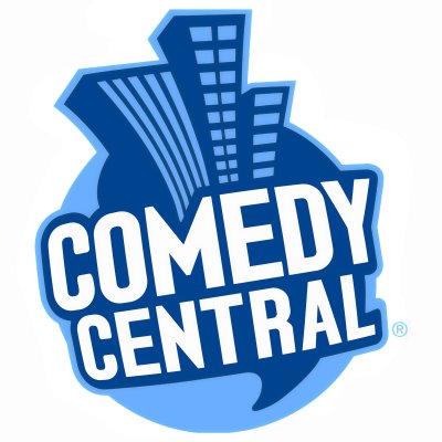
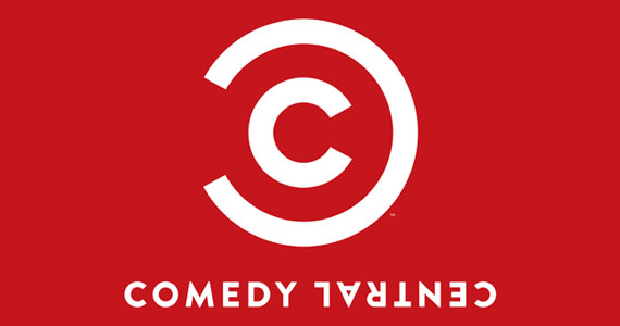
In another instance, Viacom cable network, Comedy Central, unveiled a new logo that is also getting some negative attention. In this case, the evolution of the logo is much more drastic, as depicted in the below series of images.
Given the wide difference in changes to the logo that both companies have chosen to make, the real question is, at the end of the day, will this make any major difference for either company? As pointed out to me by Cassie on a recent trip to Starbucks, it’s not like the logo is on the sign at every location. And think about that…All of the locations in NYC will most likely be minimally impacted by the logo change because you generally see the words “STARBUCKS COFFEE” in bold letters and Helvetica font. It’s really only going to apply to cups, posters on the wall, or other merchandise.
In the case of Comedy Central, the channel is staying in the same place on the dial. So if you are tuning in to Comedy Central, you probably already know you are. Even if you’re just flipping and find something on Comedy Central that interests you, looking at that new logo, you could probably reason out that it’s the channel, but, regardless, with TIVO or digital cable, you probably already know it’s Comedy Central anyway from the programming guide.
I argue that both brands are well enough established that either logo change will not detrimentally affect future business.
Related question: If you were going to design a logo for “derryX,” what would it have? Your ideas are going to help mold things toward a new future.


Advertisement